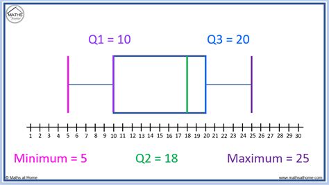
In the world of data visualization, summary statistics and plots are essential tools for understanding and communicating complex data insights. Among these tools, the box plot, also known as a box-and-whisker plot, stands out for its simplicity and effectiveness in summarizing key distribution characteristics of a dataset. This article delves into the core components of a summary box plot, specifically focusing on the five key elements that make this plot so informative.
What is a Box Plot?
Before diving into the details, let's quickly define what a box plot is. A box plot is a graphical representation used to show the distribution of a set of data. It displays the five-number summary: the minimum value, first quartile (Q1), median (second quartile, Q2), third quartile (Q3), and the maximum value. Each of these elements provides valuable insights into the distribution of the data.
1. The Minimum Value

The minimum value represents the lowest data point in the dataset. This value is plotted as the lowermost point on the box plot, indicating the start of the data range. Understanding the minimum value helps in identifying potential outliers or anomalies that might be skewing the data.
2. The First Quartile (Q1)

The first quartile (Q1) is the median of the lower half of the data, not including the median of the dataset itself. It represents the value below which 25% of the data falls. Q1 is depicted as the lower edge of the box in the box plot and is crucial for understanding the distribution's lower end.
3. The Median (Second Quartile, Q2)

The median, or Q2, is the middle value of the dataset when it is ordered from the smallest to the largest. It divides the dataset into two equal halves. In a box plot, the median is represented by a line inside the box. The median is essential for understanding the central tendency of the data.
4. The Third Quartile (Q3)

The third quartile (Q3) is the median of the upper half of the data. It represents the value below which 75% of the data falls. Q3 is depicted as the upper edge of the box in the box plot. It provides insights into the upper end of the data distribution.
5. The Maximum Value

The maximum value is the highest data point in the dataset. Like the minimum value, it's plotted as the uppermost point on the box plot. Understanding the maximum value helps identify the upper limit of the data and any potential outliers or anomalies.
Putting It All Together
These five key elements—minimum value, Q1, median (Q2), Q3, and maximum value—work together in a box plot to provide a comprehensive summary of the data distribution. By examining these elements, data analysts and researchers can quickly grasp the central tendency, variability, and potential outliers within a dataset. Whether used for exploratory data analysis, hypothesis testing, or simply for presenting findings, the box plot remains an indispensable tool in the arsenal of data visualization techniques.


What is the primary purpose of a box plot?
+The primary purpose of a box plot is to visually represent the distribution of a dataset, highlighting the minimum, first quartile, median, third quartile, and maximum values.
How does a box plot help in data analysis?
+A box plot helps in understanding the central tendency and variability of the data, identifying potential outliers, and comparing distributions across different datasets.
What are the five key elements of a box plot?
+The five key elements of a box plot are the minimum value, first quartile (Q1), median (Q2), third quartile (Q3), and the maximum value.
